For my A1 infographic poster, I have chosen to focus on the deforestation levels throughout Australia and several other countries which highly contribute to the largely increasing deforestation rate.

After conducting some research on infographic posters, and infographics revolving around deforestation, I gathered some ideas and inspiration for what I indevoured to develop for my project and began mocking up some ideas for layout and design.
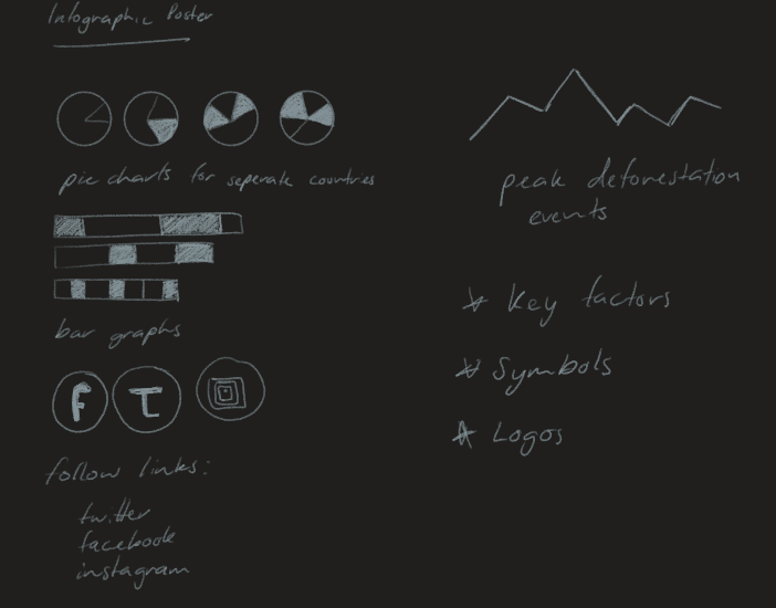
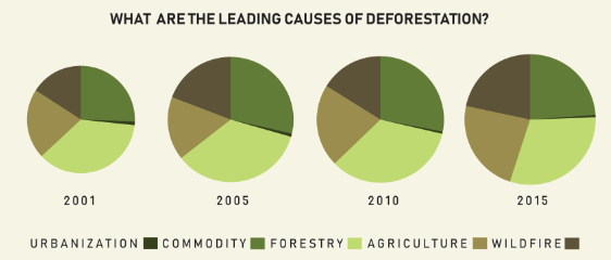
Graphs – I was undecided upon which graph format I wished to use to display most of the data present, therefore I threw around the idea of several graphs. I intended to use a number of graphs to clearly represent the growing rate of deforestation and peak moments of deforestation.
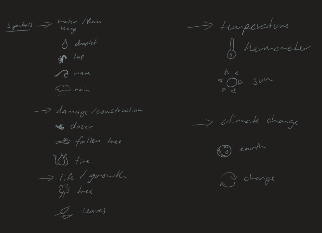
Symbols – Water consumption, leading causes, climate change, natural causes, life, regrowth, fuel
Throughout the poster I would like to include some eye-catching and meaningful symbols which represent leading factors in deforestation and/or ways to repopulate the earth with trees after deforestation.

The water cycle is a leading cause in the deforestation of trees, due to the amount of water obtained by the tress and forest land, the after cycle remains inconstant due to natural events and ever-changing climate. Some trees require more than others, therefore the efforts to satisfy all trees at once are quite challenging. Many trees can die of starvation due to lack of water consumption over dry periods of drought, while other trees may become waterlogged and rot in heavier down pours. Due to this, I feel I need to address this throughout my poster, along with other leading causes.
Construction is another major cause of deforestation; bush land being destroyed for residential or business development. I would like a symbol to represent the repercussions of this destruction on the planet due to the loss of tress, along with the milling of trees in order to produce paper.
Location – maps, charts, names
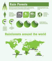
For the location specific data, I would like to be able to represent the stats in a map or location marker to draw closer attention to how realistic the threat of deforestation really is, therefore using widely known images or maps to attract the audience’s attention and familiarize them with the facts that they already are aware of and how they are contributing to deforestation rates.
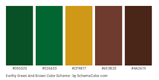
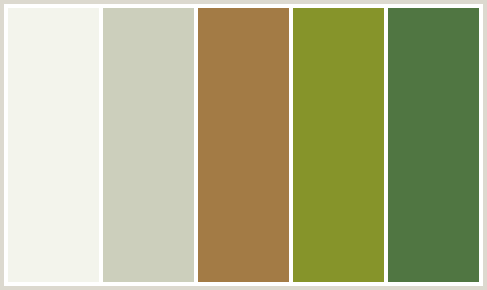
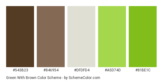
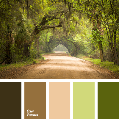
Colour scheme – green, brown, white, black
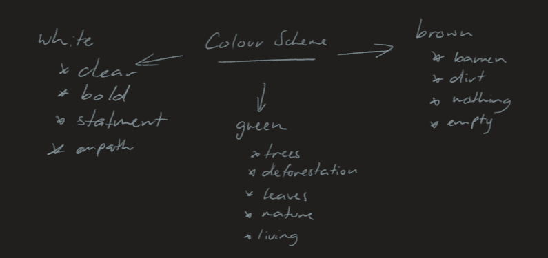
I feel that my colour scheme should connect and represent the topic of my infographic, in this case deforestation, therefore it should contain green in an attempt to represent the trees and growth of them, while on the other hand I would like to include brown hues throughout the poster to represent the destructive aftermath of deforestation, leaving nothing but dirt and debris.

Layout – column, stacked
I intend to have a simplistic, stacked layout for my infographic as I feel this is easier for the audience to navigate and follow, thus allowing them to get the most form and absorb as much information as possible through this poster. To keep the poster intriguing and maintain the audience’s attention, I aim to block some information, type, content, then follow with a symbol or graphic to visually represent the data and keep the audience engaged.
Font – loose, handwritten, informal, formal, bold, lower case, upper case, clear
The font used throughout my infographic should be clear and distinguishable from the rest of the content, as I intend to have a white or pale background colour, I feel that the font colour should contrast this, consisting of a solid black or very deep umber.
