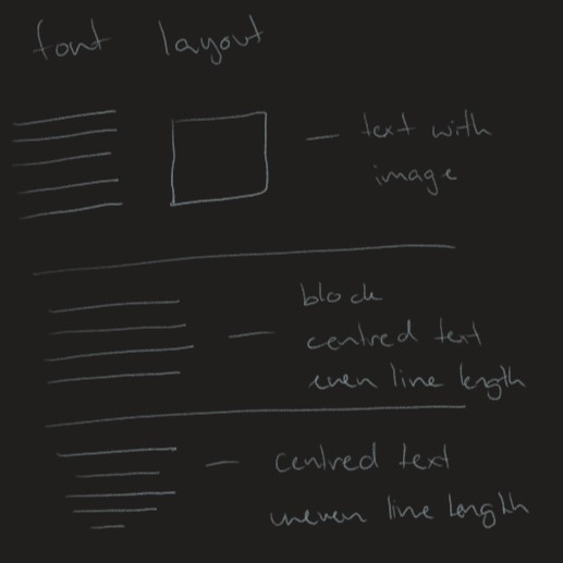
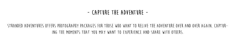
After researching and mucking around with a range of fonts I found that the thinner, uppercase script held more likeness to the appearance of what I had imagined for my website. Although when finally settling on a type face, (moon flower) I found it a little challenging to decipher between titles and paragraph font, even when adjusting, increasing and decreasing the size or thickness of the font. Therefore, I wanted to develop a symbol or significance that I could pair with titles so they could be more easily recognised. After testing a number symbols and styles, I settled on a simple “-“ (- moon flower -) to differentiate the titles from the rest of the type throughout the website. I found the use of this simple dash really helped signify and separate the titles.
After targeting the experience that I really wanted my project to offer, I sat down and brainstormed some names which related to the character of the company and the adventure it had to offer. For the end result, I settled on the name “Stranded Adventures” as this accurately represented the experience I was trying to offer throughout this camp. An adventure holiday where you could step away from everyday life, put down your technology and lose yourself in the scenic and adventures outdoors.
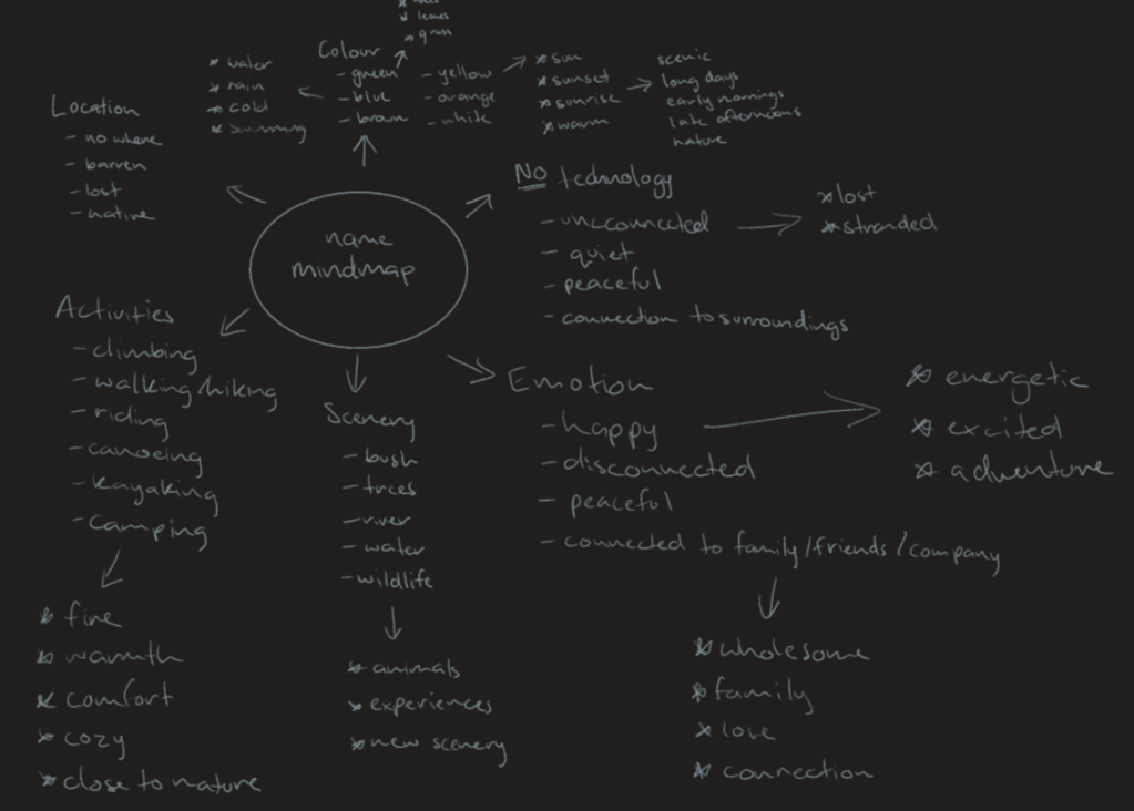
The “stranded” statement made within the name allowed the audience to immediately get an idea of the experience being offered to them as the word stranded suggest being lost or being present within and unfamiliar location or situation which would most likely be the case for most attending the stranded adventures camp, as in this day an age not often do people get to step away from technology and truly lose themselves in the outside world with no distractions.
For my logo, I originally stated that I wanted something that resonated with the activities and experiences offered by the camp, therefore after some mind mapping and brainstorming I found that I was mostly keen on the idea of a scenic symbol in the logo, whether it be a tree, or a mountain, or some water, I felt it needed something that symbolised nature and the outdoors.
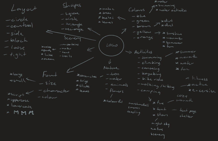
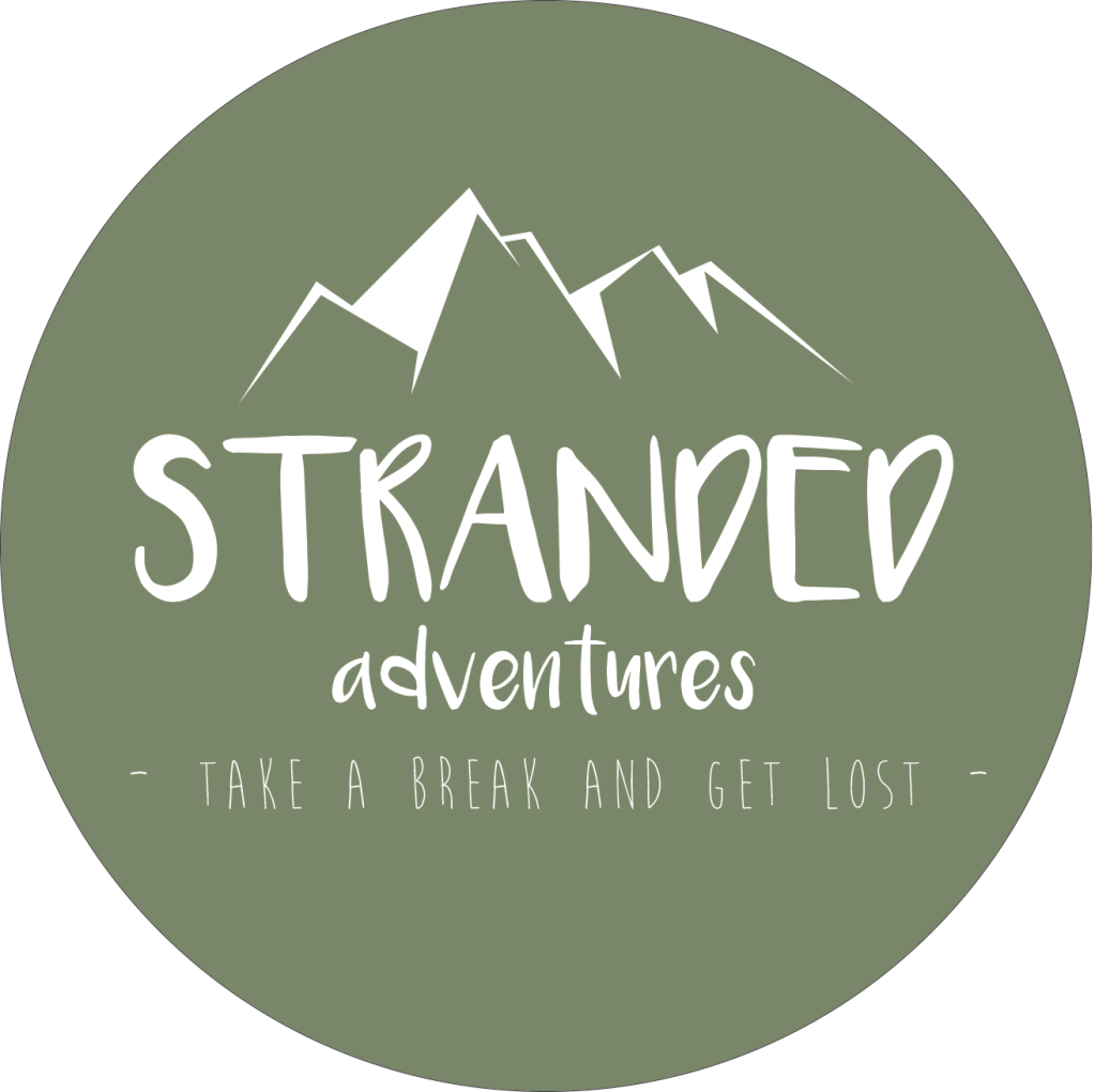
Since I had established the name of my camp at this point, I had to sit down and think of what best represented that of being lost or stranded, I finally concluded that mountains best represented that in my opinion. Mountains often are large land masses which are located in offset places away from communities and most definitely technology, you’d rarely, if ever, see a wind turbine or a radio tower on the top of a stranded mountain in the middle of nowhere, therefore due to this discovery I chose to develop a logo around a mountain.
As for the style of the mountain and the layout of the text in the logo, I wanted something simple yet unique, much like the experience being offered by stranded adventures, hence why I settled on a simple circular theme which the font would follow the curve of a circle around the centred symbol and name. The font again needed to represent the charter of the camp, something distinctive yet relaxed enough to resent with the relaxed disconnect holiday/getaway offered by stranded adventures.
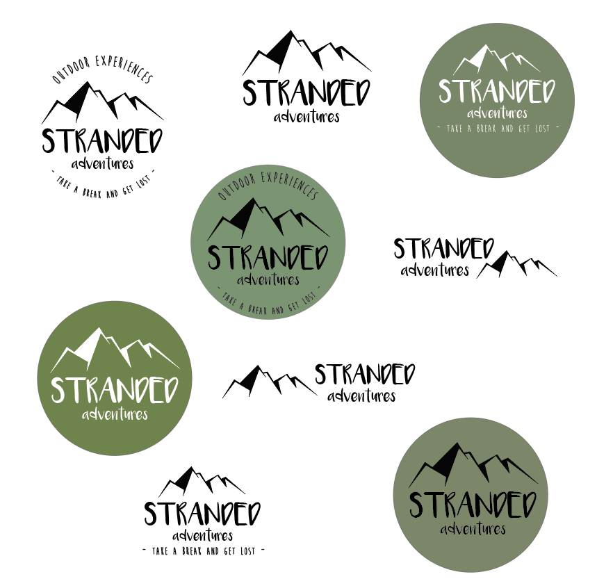
Finally, as all good logos should conclude of a horizontal, vertical and alternate layout, I than had to manoeuvre the symbol and font to create a new logo that could be used in alternative to the original.
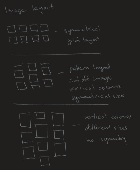
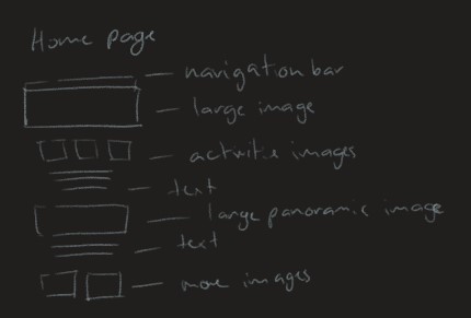
As for the website navigation and layout, I opted for a simple scrolling navigation system, and for the layout I decided upon a simple centred text layout with mostly symmetrical images.