What is an infographic? And what do they do?
Well an infographic is generally produced on a poster although can come in a range of formats and consists of a visual representation of data sets or important information. Generally, infographics use charts, graphs or diagrams to convey their information across to the audience in a visual manner rather than reading out lines on informative text.
Therefore, in order to achieve my goal of raising awareness of rising deforestation rates I chose to develop a poster on deforestation, which would consist of many formats of infographics to capture an audience’s attention and portray data in a clear and effective visual manner.

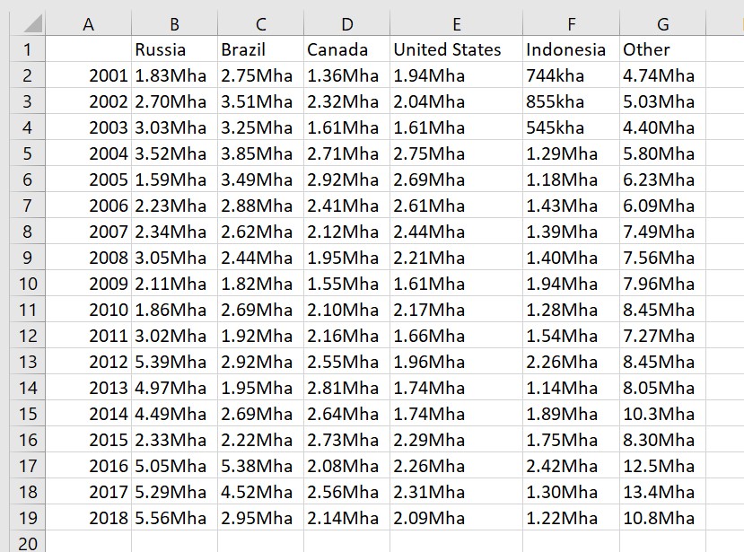
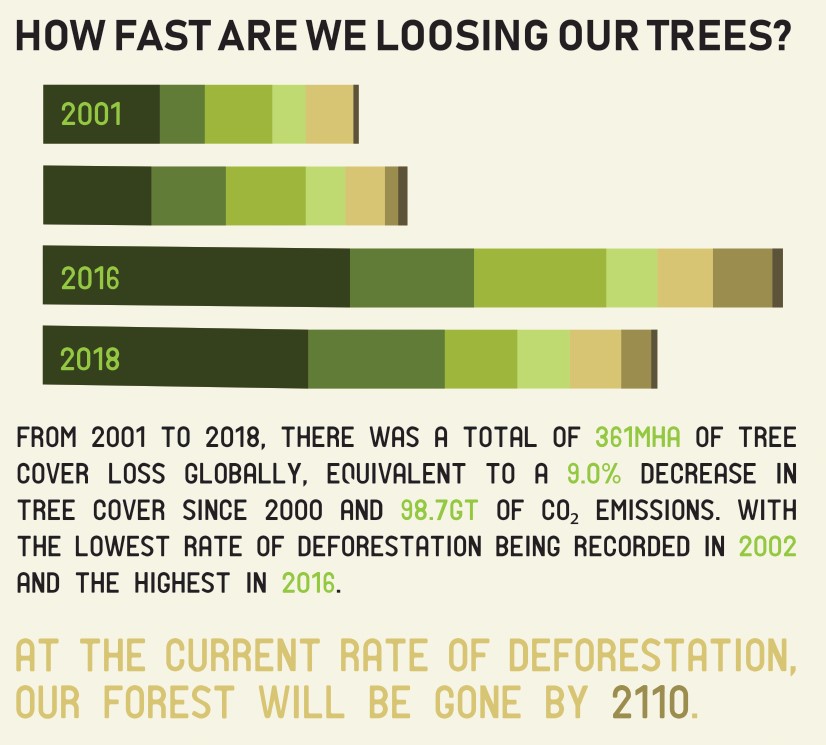
As for representing my data, I chose to keep it fairly simple and opt for the typical stacked bar graph and pie chart. During the research phase of my project I accumulated a list of countries which held the highest contribution to deforestation, along with this information, I gathered key dates and time frames at which the deforestation rate peaked or decreased, therefore to show this in a ratio that an audience could clearly see and distinguish, I used a stack bar graph to plot the data, and then extracted the key segments which showed the rise or fall of deforestation rates in the key contributors to deforestation.
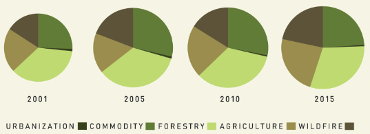
Along with finding the contributors to deforestation rates, I found the main factors in which lead to deforestation, as I found this to be quite useful and important data, I wished to produce this in a pie chart, in which each segment could portray the ratio of different impacts leading to deforestation.
Following the theme of impacts on deforestation was the impacts deforestation had on other aspects of life, such as the growth of flora and fauna, the water cycle and climate. Now these are all major factors and major impacts caused by the lose of our forests and bush lands, therefore I thought it very important to be displayed somewhere throughout the poster for the audience to see, again this feature needed to be eye-catching enough to attract the audiences attention, although it didn’t need to demand the focus away form the more important statistics. That being said, I took all these aspects and features into consideration, and developed a set of small symbols to represent the key impacts of deforestation.
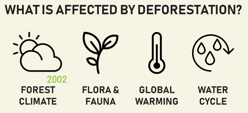
Symbols are an effective tool in gaining the audience’s attention and simply giving them quick and easy insight into what the topic is about, while not drawing away from the main topic.
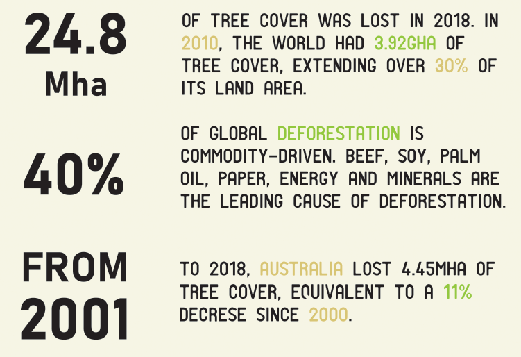
Finally to include some actual text content, while still maintaining the aesthetic appeal, I included a list of statistics in the poster with an eye-catching increased font size, and differed colours highlighting key words or stats throughout the sentences.