For our first VCD 102 lecture we were posed with the phrase “form follows function” which for anyone who attended VCD 101 last semester would be familiar with. This phrase suggest that the primary form of the intended design should also flow onward towards the function of said done. This is a key factor within this subject as the Visual Communications major revolves around the concept of design.
To begin the first few week’s, lectures consisted of some basic yet fundamental topics and rules of design. In addition to the lectures, tutorials offered a more physical touch on topics discussed in lectures where we begun researching statistics to start developing our own infographics. Once we located some data to experiment with, we took that into Word Excel, following by Adobe Illustrator where we were able to test and experiment with different ways of setting out our data and how we could adapt and display it in a way that would make its form follow its intended function.
WHAT IS INTERACTIVE DESIGN?
It is the design of the interaction between users and products. / The goal of interaction design is to create products that enable the user to achieve their objective(s) in the best way possible.
(Siang, 2019)
For the first week’s lecture, we focused on gathering an understanding of what interactive design was and how it can be used in a real-life scenario. Interactive design revolves around how well a designer can portray data to an audience, and communicate that data both realistically and efficiently, while still focusing on all aspects of appearance to attract the audiences attention.
Within these beginning weeks we were left to think about interactive design and what that was, how it worked, and what its purpose was. Interactive design consists of how a product acts in relation to its audience based on the development and design of said product.
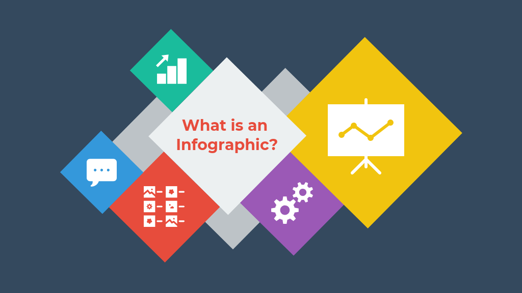
WHAT IS AN INFOGRAPHIC?
In simple terms, an infographic is just another way of visually representing set of data or information, generally to promote a change or understanding of the topic.

In essence, an infographic is a form of visual communication meant to capture attention and enhance comprehension.
(Ritchie, 2019)
Inforgraphics can be curated and displayed in several ways, for example some data may be represented through a bar graph, one of the most common and legible ways to display a set of data. Another form of representing data sets could be through the use of pie charts, often used to show small sets of data with easily distinguishable subjects.
Along with bar graphs and pie charts are some ever slightly more advanced ways of communicating data visually. These can consist of histograms, line charts, dot maps, tree diagrams, bubble maps, etc. Each individual type of infographic is suited more so one set of data than another and can be more useful depending on the subject.
Over the first few weeks we discussed our first assessment, which would be to accumulate data from a particular source and curate an info graphic around that information. To begin, I started looking at the Australian Bureau of Statistics website, in a hope of sparking some interest in a topic as I had zero idea of what I wanted to base my infographic on.
After scrolling through some of the data sets available I started to grow an interest in certain topics such as, land mass, forestation, landfill and some similar things, I than proceeded to narrow down my research further and focus directly on deforestation rates, now I am aware that after deforestation the population has accelerated again although I will solely be researching the deforestation rates.
As I found after countless time spent researching theses deforestation statistics, the entire surface area of each country would be just too much data to incorporate onto my small infographic poster, therefore I chose to investigate only the six highest contributing countries to deforestation, Australia’s deforestation statistics for comparison, and all other countries as whole. This provided me with more than enough information to curate my own infographic targeting deforestation rates.
REFERENCES
Ritchie, J. (2019). What Is an Infographic? Find Out What They Are and Why They’re Useful. [online] Column Five. Available at: https://www.columnfivemedia.com/infographic [Accessed 15 Aug. 2019].
Siang, T. (2019). What is Interaction Design?. [online] The Interaction Design Foundation. Available at: https://www.interaction-design.org/literature/article/what-is-interaction-design [Accessed 15 Aug. 2019].
