
WORK 1 – CONSTRUCTIVISM
Research
Constructivism was a groundbreaking movement in art, design, and architecture that began in Russia in 1913, but really rose to prominence after the Russian Revolution of 1917.
(Strizver, 2019)

Agitation and Propaganda: The Soviet Political Poster 1918–1929
Alexander Rodchenko was an artist whom worked in relation to the constructivism art period, therefore several of his works, including that of this Soviet Political Poster focused directly on placement and movement of objects within a free space. Clustering and alignment are strongly used within this piece, forming a relationship between the content, this method can be used within propaganda art such as Alexander Rodchenko uses within this poster, to draw the audience’s attention to the piece.
Alignment is used within this poster to create a visual connection between each object and text within the poster, thus tightening and creating a neater appearance to all elements present, therefore making the poster more appealing to the naked eye. Along with alignment, clustering is similarly used to create some sort or direction within such an abstract piece of work, so that the eye follows the content in a direction which the artist wishes for the content to be read.
Constructivism was an artistic and architectural philosophy that originated in Russia beginning in 1919, at a time when the revolution of 1917 had been consolidated and the new Soviet government was building a new communist society.
(Staff, 2019)
WORK 2 – POSTMODERNISM
Research
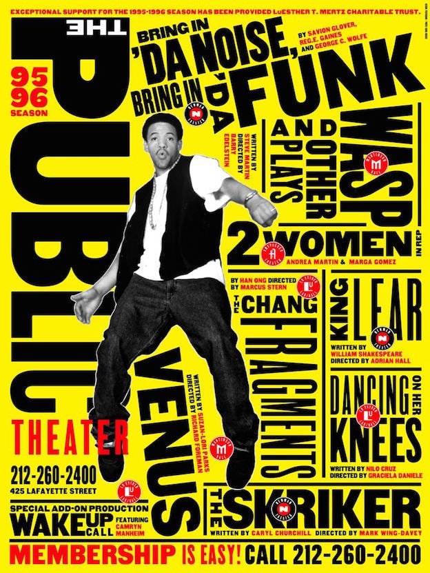
The Public Theater 95-86-Season 1995
Paula Scher is well known for her postmodernism works in which she took a modern aspect and contradicted it with another concept that emerged afterwards, therefore using numerous colour and font weight along with spacing and uncommon and often historic typefaces. As shown within Scher’s work in The Public Theater, season 95-96, she presented an abundance of information in a new and confronting way, her text-heavy posters grabbed the attention of those passing by with its dynamic and bold look, much unlike anything else around at the time.
Within this work clustering and overlapping is heavily present, used in conjunction with differing weight and typefaces in an effort to direct the audience through the confronting and almost confusing structure of the poster, as the audience’s eye is directed towards the large bold font first, further leading towards the smaller and more inconspicuous content, therefore suggesting the bold information houses content of higher value.
The International Typographic Style, also known as the Swiss Style, is a graphic design style developed in Switzerland in the 1950s that emphasizes cleanliness, readability and objectivity. Hallmarks of the style are asymmetric layouts, use of a grid, sans-serif typefaces like Akzidenz Grotesk, and flush left, ragged right text. The style is also associated with a preference for photography in place of illustrations or drawings.
(Historygraphicdesign.com, 2018)
REFLECTION
At this stage in my work I have begun taking photographs of letter forms in everyday objects within my surroundings, this has proven to be a lot harder than I first considered. I often found simplistic letters such as U’s and O’s although I have been struggling to find more complex letters such as R’s and Q’s. I have formed a better understanding of how some objects can be looked at an perceived to create letter forms since the first tutorial of this subject.
Currently I have about 8-10 letters of the alphabet which I have transferred over to my computer and began editing within Photoshop, messing with the hue and saturation along with the colour levels present within the image. I have a few saved copies of exaggerated and enhanced coloured images along with a black and white image of some letters.
Reference list
Staff, C. (2019). The easy guide to design movements: Constructivism. [online] Creative Bloq. Available at: https://www.creativebloq.com/graphic-design/easy-guide-design-movements-constructivism-10134843 [Accessed 28 Mar. 2019].
Strizver, I. (2019). Russian Constructivism and Graphic Design – CreativePro.com. [online] CreativePro.com. Available at: https://creativepro.com/russian-constructivism-and-graphic-design/ [Accessed 28 Mar. 2019].
Historygraphicdesign.com. (2018). The International Typographic Style | History of Graphic Design. [online] Available at: http://www.historygraphicdesign.com/the-age-of-information/the-international-typographic-style [Accessed 28 Mar. 2019].
Featured Photograph by Christian Heitz.
